

The Worst Model in History: How the Curve was not Flattened
And how about climate models?

I am reproposing here a post published one year ago on the old version of the Seneca Blog. It is part of a series on the “Covid Saga.” ( slightly edited and shortened).

"Flattening the Curve" was an incredibly successful meme during the early stages of the Covid epidemic. Unfortunately, it was based on a model that I can describe as the worst ever proposed in history (or maybe the second worst, after the one that assured Napoleon that invading Russia in Winter was a good idea). Here, I explain some of the reasons why the model was so bad, the main one being that it didn’t provide clear goals to attain. Just like other vague concepts such as “Proletarian Paradise,” “flattening the curve” could be twisted and fudged at will to give politicians a way to rule and oppress ordinary people. I also include a discussion on whether climate change models might suffer from the same problems.
You may have heard the quote, "All models are wrong, but some can be useful." It is true. But it is also true that wrong models can be misleading, and some can be lethal. In history, some of these lethal models were fully believed ("Let's invade Russia, what could go wrong?), while the lethal consequences of following some current models are still not understood by everyone, ("Economic growth can continue forever, why not?"). Other models are telling us of the lethal consequences of not following them; this is the case with climate models. There are many kinds of models, but you can't deny that they are important in determining human actions.
In this post, I'll discuss the model that gave rise to the concept of "Flattening the Curve" at the beginning of the Covid-19 epidemic. It was based on the idea that "non-pharmaceutical measures" (NPIs) would slow down the diffusion of the virus and avoid overloading the healthcare system. It was one of those models that looked good at the beginning but that turned out to be a disaster. Among other things, it gives us a chance for a critical examination of climate models: could they suffer from the same problems?
Regarding the "Flattening the Curve" story, the idea of slowing down the diffusion of a viral infection was not wrong in itself. Already thousands of years ago, people noted that many illnesses are transmitted from person to person and that staying away from sick people can reduce the chances of infection. But country-wide lockdowns, universal masking, and the like had never been tried before. So, how would you know that they could have a significant effect?
Indeed, before the great COVID scare, the general opinion among practitioners and experts was that quarantines and other drastic measures were useless and even counter-productive. Then, in early 2020, a new concept burst into the scene and took the memesphere by storm: "Flattening the Curve." It was expressed in the form of a graph that appeared over and over on the media in slightly different forms but always showing the same concept. Here is an example among the many.

Image from "The New York Times," 2020,
The idea looked good at first, but, as usual, the devil was in the details. Let's start by noting that the model is based on the typical shape of the curves describing an epidemic cycle. It occurs when something grows (e.g., a virus) by exploiting a resource (e.g., human beings). If the resource is limited, as is the case for the number of people that can be infected, then the growth of the infection will start slowing down, reach a maximum, and then decline. The result will be a "bell-shaped" curve, a behavior that has been known from the time of the Great Plague of London in the mid-17th century. (note, incidentally, that epidemic curves do not normally show the "Seneca Effect," that a faster decline in comparison to growth. It is because the system is relatively simple, and viruses are not affected by "pollution").
So, the "Flattening the Curve" model was based on something real; nevertheless, it had enormous problems. Take a careful look at the figure above. The model implies no less than two separate miracles. The first is that the "zero" of the x-axis is supposed to coincide with the "first case." It implies that, miraculously, the government would be so farsighted to decide to lock down a whole country on the basis of a single observed case or just a few. Such a government never existed, and you may argue that it cannot exist in the real world. In practice, NPIs were mandated only when the epidemic was well on its way and fast growing. Note also how the "Protective Measures" curve touches exactly the limit of the healthcare system's capacity without overcoming it. How the measures could be calibrated so precisely is another miracle.
The need for two miracles is bad enough for a single model, but there is a much worse problem with it: the model shows two curves with the same shape; they differ only in scale, a parameter that cannot be reliably determined in the early phases of an epidemic cycle. Then, of course, in the real world, the epidemic will follow only one of the two curves, and how do you know which one? In other words, how do you know if the measures are having any effect? Remarkably, the question was almost never publicly asked during the epidemic. The "flattening the curve" model soon became a political issue and, in politics, there are questions that you are not allowed to ask. Nobody ever said what “flattening the curve” exactly meant, what the goal was, and when the NPIs were no longer necessary. That gave politicians an infinite leeway to harass people with absurd rules.
So, let me try to step out of politics and use science to ask a forbidden question: how would the curve react to the "measures" applied while the curve has already started to grow? Everybody expected an effect, of course, and, obviously, a strong effect if it had to be worth the effort. Tomas Pueyo correctly used the term "the hammer" to describe the expected effects of NPIs (one of the very few correct observations he ever made). And if you hit something with a hammer, you do expect some immediate effect. But what kind of effect, exactly?
In a previous post, I described a simple SIR (sane, infected, removed) epidemic model, not a sophisticated model but several steps higher on the scientific scale than a purely qualitative two-curve diagram. The model can be easily tweaked to show the effects of a sudden reduction in the transmission factor (Rt) of the infection as a result of NPIs (note that it doesn't apply to vaccines, which can only be introduced gradually). Below, you see a typical result of my calculations.

The vertical axis is the infected fraction of the population (the "prevalence"), which should be proportional to the number of measured positive cases. The horizontal scale is the time; a typical epidemic cycle lasts a few months. The graph is roughly modeled on the Italian case in early 2020, and it assumes that the "measures" are mandated on the 20th day of the start of an infection cycle that lasts a few months. The model assumes that the NPIs reduce the infectivity (Rt) of the virus by 50% (as it was expected to happen).
The result is that the slope of the prevalence curve changes when the NPIs are put in place. You can play with the parameters in different ways, but for a significant decrease in the virus transmission rate, you will always see a discontinuity in the curves in correspondence to the start of the measures. Overall, this is what the real "flattening the curve" should look like.
Of course, there exist much more sophisticated epidemiological models, but good modelers know (or should know) that complicated models are not necessarily better than simple ones. Here I don't want to enter into the academic debate on the effect of NPIs (it never reached policymakers and the public, anyway). Just as a quick note, you may wish to take a look at this 2020 paper. It was published by the group led by Neil Ferguson at the Imperial College in London, who was one of the main proponents of lockdowns. The authors argue that lockdowns are effective, but if you examine the paper carefully, you'll see that their own results do not support their conclusions. In figure 1, you see that the model predicts a strong and immediate change in the number of infections, which is not seen in the real world. (I am not the only one who noted the problem). Below: from figure 1 of the paper. The blue line is the theory, the brown one is the observation. The authors argue that the actual number of cases was much larger than the reported ones. Maybe, but, still, reality doesn’t show any “step” comparable to the theory. How they can claim anything from this figure is a mystery. An even bigger mystery is how this paper could be published in “Nature,” but so it goes.
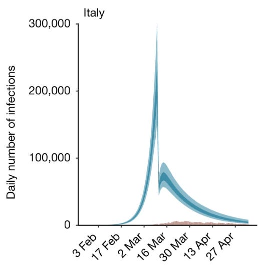
Rather than going into the details of complicated models, let's just use common sense. The NPIs are a sudden change in the parameters of the system. When the government orders people to stay locked at home, most of them do that immediately. So, you do expect an immediate effect on the shape of the epidemic curve. The problem is that you don't see anything like that in real-world data. Below, the case of Italy in 2020. NPIs were enacted on March 10th, when the curve had reached about 20% of the peak. The curve continued to grow along the same trajectory for 19 days more.

Italy is just one case. Maybe, if you are a real first-class sleuth, you might find some cases where you can evidence a discontinuity in an epidemic curve in correspondence with the NPIs being enacted. But we have hundreds, probably thousands, of examples, and they are almost always smooth, except for the unavoidable random noise. The conclusion can only be that if the NPIs had an effect, it was very small. Incidentally, these observations are consistent with the recent Cochrane Review that used different methods to examine the effectiveness of face masks and other NPIs in slowing down the diffusion of viruses. No detectable effects were found.
In the end, more than two years of "measures" were imposed on citizens on the basis of a model that implied miracles and didn't include methods to verify the effect of the recommended actions. The damage done to society was enormous in psychological, economic, and human terms, all for effects that turned out to be so small not to be measurable.
The question, then, becomes how it could be that almost everyone in the world was completely overtaken by such a bad model—possibly the worst one ever developed in history. The story is related to the military implications of epidemics as bioweapons, but I told it in a previous post. Here, let's examine how the same considerations can be applied to climate models, another kind of model that may affect our lives in ways even more pervasive than the "Flattening the Curve" model.
How about climate models?
I am sure that while you were reading this post, you had a small ghost appearing in the back of your mind (or maybe, a big ghost in your frontal lobes). Could climate models be misapplied to the real world in the same way as epidemiological models were? The risk exists, but remember that the way to hell is paved with generalizations.
So, let's take a look at one of the typical models shown in a recent IPCC report.

Superficially, you might see the blue curves as something similar to the idea of "flattening the curve" promoted for the COVID-19 epidemic. And you may think that slavishly applying some similar "NPIs" against warming would lead to a similar disaster. But the differences are many and deep.
First, with climate, we are dealing with quantitative models calibrated on temperature and CO2 concentration data, which are available as direct measurements for several decades and as indirect ones for hundreds of millions of years. A comparison with the "flatten the curve" diagram, a sketch drawn by hand, would be a little cruel, to say the least. Then the "fan" of scenarios above doesn't imply miracles. It starts at the current time, not at a hypothetical "zero warming" point. It also doesn't assume that it will be possible to keep the warming below reasonable values. More than all, it provides the tool you need to evaluate the results of your interventions: measure the correlation between greenhouse gas concentration and temperature, and you'll know what you are doing (although, of course, the time scale for climate interventions is much longer than that of NPIs for epidemics).
That doesn't mean that climate models must necessarily be right. The problem here is that the discussion on climate change has often been hijacked into a debate on whether models can make accurate predictions. This is just one of the elements of the problem and not the most important one. Multiparameter models of complex systems are mainly tools to interpret the data: they are meant to tell you what's causing what and how. In the case of climate change, the models tell us that the correlation between temperature and the concentration of greenhouse gases is consistent with a causal relationship according to what we know of atmospheric physics. In other words, they provide evidence that greenhouse gases are "forcing" the climate system to heat up. But you could arrive at this conclusion even without models: just on the basis of known physics and observations. After all, Svante Arrhenius had already arrived at a reasonably correct estimation of the parameters of the system in 1896 without using sophisticated models.
Then, suppose the concentration of greenhouse gases continues increasing. In that case, we can expect that temperatures will keep increasing, too, and over a certain level, that's surely not a good thing for us. Climate models, incidentally, tend to be optimistic in the sense that they are normally unable to describe the kind of abrupt climate changes that occur in the form of "Seneca Cliffs," which were observed in the remote past. In climate science, they are often called "climate tipping points," and they are surely extremely bad for us.
This said, there remains the typical problem of multiparameter models: that of separating the roles of parameters that have similar effects on the system. Climate models might overestimate the role of greenhouse gases and underestimate the cooling effects of the ecosystem's metabolic processes, as argued, for instance, in this paper by Makarieva et al. In that case, we risk neglecting the role of an important factor in what we are seeing.
So, do we run the risk of making the same mistakes with climate change mitigation that were made with the attempt to flatten the curve during the COVID-19 epidemic? That is, do we risk disrupting the fabric of society for an overestimated risk or for the misattribution of the causes of the problem? I'd say it is unlikely, but we need to keep an open attitude and accept that, with new data, models must change (which is exactly what was not done with the COVID-19 epidemic). The only certain thing is that disasters are unavoidable if complex systems are left to politicians to manage.